[10] Put It all together


Postmodernist and ‘remix’ techniques are a vibrant part of our design culture today. Find an example of contemporary design—2D or 3D—and post it to your blog along with a description of what techniques it utilises (i.e. historical quotation, ornamental eclecticism, wit or irony, manipulations of scale, cultural symbols etc.) and how they serve to ‘add meaning’ to the work.

The Postmodern and the "Remix" philosophies are an important factor of contemporary design. After the modernism movement the youth began to rebel, putting forth their new perspective on art and design: that the modernistic, rational ideals of "Less is more", a quote from Mies Van Der Rohe, were too restricting and the freedom of individual and cultural expression and irrational art and design were more important. 

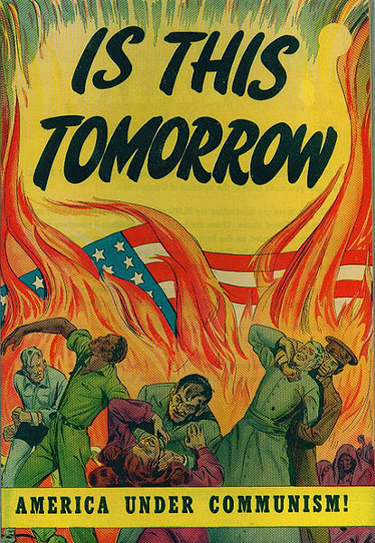
The American Ideal Family as
portrayed through the media.
"I am for messy vitality over obvious unity" (Venturi,1966) is a quote that sums up the movement's direction. I believe it was justified revolt. This generation was living in a time of abundance, of consumerism and buyer choice, and yet they were being restricted, moulded into the perfect family - bland and uniform. They fought offset this  with experimentation; including wacky clothing, furnishings and pop art. A large method of this experimentation was remixing.

"Mickey to Tiki Tu Meke" - Dick Frizzel 1997
My example is a New Zealand's own Dick Frizzel. In this humorous pop art print, named "Mickey to Tiki Tu Meke", Frizzel incorporates many elements to add meaning. Not only this but I believe that because of this mash up of meaning, it gives the print an aura, a history. Frizzel has incorporated the highly commercial, American symbol Mickey Mouse with the historically rich, Maori icon the Tiki. Because of this combination, the commercialism ideology is compared to the Maori culture. Though prints are able to be reproduce an infinite amount of times, a rich meaning continues to transcend from the piece through the mash up of history and heritage. The value of the piece is how it draws on the past to comment present.


Woodam, Pop to Post-Modernism: Changing Values (pg183-203)
Petty, M, M.( 2011), Lecture 10, Postmodernism and the Remix, Victoria University ,Te aro Campas


[9] Political Manipulation


What kinds of political or ideological messages inform design or the branding of design today? Identify one example and describe in what ways it expresses larger cultural, political, or ideological beliefs

 After America and Russia acknowledged the use of bombs would result in no honest victor, a cold war broke out with the countries' ideology and social structures becoming their 'front lines'. America began to sell the consumerism ideals to the world, through displaying the American way of life, e
xalting the freedom to spend money on whatever you choose.


America's Cold war propaganda terrified its public into believing that socialism was an evil, as a means to push the consumerism ideals further, as depicted well in the government's mass media. Though it is not called 'propaganda' today, the development of design for political gain is just as manipulative and influential as ever.


Talking about manipulation, the politician and former vice-president Al Gore formed a 'Global-Warming' alarmist cult, and persuaded the world that the earth’s CO2 emissions were causing the earth’s temperature to rise. This video demonstrates the emotional debate that tugs at the heart strings and causes a result - change.

Al Gore’s green alarm bells influenced design hugely, especially in the area of automobiles.  The 2011 Nissan Leaf is one of the most eco-friendly cars that you can own this year. Not only is it extremely fuel efficient but “recycled materials made from home appliances, old car parts and plastic bottles are used extensively throughout the vehicle” (KBB.com, 2011). Like America re-branding itself after the war, so too did the world after the CO2 'scare', causing every company to create 'greener' items and the public to buy these items off the shelf.


But why is it that you can straight away recognise a ‘green’ car? I think that designers are doing this so that subconsciously you automatically no or not if that driver is supporting the campaign for the ideology that is being ‘green’ and you then assess yourself and what you drive. No more is it about ‘saving the planet’, it has morphed into a status symbol for the upper-middle class.

Petty, M, M.( 2011), Lecture 11 Politics of Design, Victoria University ,Te aro Campus


[8] Function x Economy

Do you agree or disagree with the position that design is a result of “function x economy”? Do you think design today an ‘art’ or a ‘science’? Should it be one or the other, or can it be both?

In 1928, Bauhaus director Hannes Meyer argued that design was the result of ‘function x economy’ and was almost completely influenced by science rather than art. 


For someone that lives in today's age of consumerism, I could not possibly agree with his view that design is influenced by science rather than art. In order to evoke a desire for an object, design's art-science seesaw can't be tipped entirely one way or another. No single aspect is responsible for design but instead it is the combination of these that dictate the final result; each must be considered. Yet at the same time good design demands science to be prioritised before art, else design would not fulfill function. 


The Bauhaus is the perfect example of the combination of arts and technology (science), it was itself a “consolidation of Weimar’s Academy of Fine Arts and the city’s Arts and Crafts School” (Raizman, 2004) making it draw upon areas from both the fine art side and crafting side. As Walter Gropius said earlier in 1919, “Architects, sculptors, painters, we all must return to the crafts! ...Let us create a new guild of craftsmen without the class distinctions that raise an arrogant barrier between craftsman and artist."(Gropius, 1919). What I take from this quote is that a union between science and art becomes successful once the machine is understood, and therefore materials, processes and aesthetics can be maximized and controlled. I believe it is this synergy that designers must master. 

Grete Schutte-Ligotzky's scientifically
managed kitchen.
Meyer's position that design is a result of "function x economy" is not only disputable, but also short sighted and ignorant. Certainly in the 1920s, there was a demand for scientific management, an over haul of how we lived, but he must have recognised the human desire to own beautiful objects. Ligotzky's extremely functional kitchen was a prime example of this stale living environments. Practicality was a major focus, where everything was rationalized to create the most out of technology.


What has gone here is design's art-science seesaw has fallen on the science side. Meyer's vision, exemplified in Ligotzky's kitchen, lacks art. It lacks life, soul, colour, aesthetics and an emotive connection. Though we have taken much from this revolutionary kitchen, I am glad we live in a world where aesthetics are always considered, even in the most practical of kitchens.


Raizman, D. (2003). The “First Machine Age” in Europe. History of Modern Design. New Jersey, United States: Prentice Hall Art.


[7] Utopia

In this week’s lecture we discussed the concept of the “symbolic universe” as a cultural “structure of legitimation” capable of organizing the social world as comprehensible and connected. The structure of the symbolic universe then, places the individual in a known and knowable space. Such social structures are critical for societies in transition. Can you identify the creation of any “symbolic universe” today (or in recent years)? How might media and design be implicated in the construction of these social universes today?


"By utopia I mean ...: a good, beneficent place, better in all ways than that in which its creators live." This picture of a utopian future was painted by the American Fairs of the 1930s as a response to the Great Depression. "These fairs delivered ... a buoyant, optimistic message extolling the positive consequences of science and technology for life in the future." The Chicago and New York World exhibitions were a chance for America to evolve. Because the fairs were held in the middle and the end of the Great Depression, times of significant desperation and aspiration for a fruitful future.


"These visionary displays posited a future in which scientific advancement and industrial technology acted as progressive and liberating forces which promised a society of leisure and abundance, that, in fact would be realized after World War II." Design was, and still is, the fuel that constantly thrusts society toward the ever distant symbolic universe. This American movement took the abundant scientific and technological advancements presented during the Chicago and New York World Fairs, and constructed a future utopia. Designers were the visionaries, developing the present to alter what lies ahead. Through world fairs, this rapid progress achieved a fresh lust for the future, and nurtured the idea of the utopia being reality's escape.

Similar to the 1930s, today's public persistently attempt to reach a greater future. In this technological era, constant advancements in the fields of science, medicine and technology gives today's public hope - their symbolic universe. With the whirlwind of new product and cures, the public are in no doubt that their lives are advancing for the better. We live in a society where there is a new technology or advancement just around the corner, guaranteed, specifically in the field of science.

Advancements have been made in the field of the brain’s vision on the world. "UC Berkeley scientists have developed a system to capture visual activity in human brains and reconstruct it as digital video clips. Eventually, this process will allow you to record and reconstruct your own dreams on a computer screen." The concept of recording your own dreams has for centuries been an unrealistic future. Though utopia is forever out of reach, the fruitful future is arriving so rapidly as if the world's rate of progress is accelerating, especially in this era of technology and mass design.


Folke T. Kihlstedt, “Utopia Realized: The World’s Fairs of the 1930s,” In Imagining Tomorrow, ed. Joseph Corn (1986)
Kihlstedt, F. (1986). Utopia Realized: The World’s Fairs of the 1930s in Imagining Tomorrow: History Technology, and the American Future (pp.97-118). Cambridge, Mass.: MIT Press.
Jesus Diaz (2011) Scientist Reconstruct Brain's Visions Into Digital Video In Historic Experiment http://gizmodo.com/5843117


Authenticity [Blog 6]


“To an ever greater degree the work of art reproduced becomes the work of art designed for reproducibility. From a photographic negative, for example, one can make any number of prints; to ask for the authentic print makes no sense."


The 20th Century philosopher Walter Benjamin wrote in the 1935 essay The Work of Art in the Age of Reproduction, “to ask for the ‘authentic’ print makes no sense”. As described by Manovich's essaythe introduction of the 'Third Eye' as well as its collision the computer new vision for the future. "Both media machines and computing machines are absolutely necessary for functioning in the real world" and due to this view humans have used computing devices and media machines in the forefront of their development. But with these items, has authenticity been lost with the debut of fast reproduction capabilities?

See adjacent text.
Leonardo Da Vinci's "Mona Lisa"
Although Benjamin suggests that the authenticity of art has been usurped by mass production, I agree that the authentic is lost in this age of digital design and manufacturing. Society still values the rare true originals that have a personal connection and history. Take this picture of Mona Lisa. You look at it but it holds no value to you. The correctly copied pixels on your screen contains no aura - it is unauthentic, it does not connect personally, and the picture contains no history. It stems from the consumerism theory of 'we see we want', and with the availability of mass media reproduction, we could all see and receive but at a price - aura. 

 So, the idea of authenticity becoming redundant in digital media is questionable, as originality still exists as seen in the contrast between this copy of the Mona Lisa and the originally, sitting in true time and space. And while aura can be figuratively watered down through mass production, and digital media design itself may not always emanate reverence, that does not mean that the digital realm and mass manufacturing cannot communicate and enhance aura. Even with millions of books with images of famous paintings being printed, and billions of images of great artworks floating in cyberspace, to stand in front of the actual Mona Lisa would be a completely different experience, and with digital media such an experience may be more greatly anticipated. The wide distribution gives the Mona Lisa a sense of omnipresence, giving the experience of standing before the original, the origin of all the reproductions, a great sense of aura.


Manovich, L. The Language of New Media. The MIT Press, Cambridge, Massachusetts, London, England. 
Benjamin, W. (1992) The Work of Art in the Age of Mechanical Reproduction (pp. 211-244 ) in Illuminations, trans. Harry Zohn. London: Fontana.
Mona Lisa take from -http://en.wikipedia.org/wiki/File:Mona_Lisa,_by_Leonardo_da_Vinci,_from_C2RMF_retouched.jpg


Colour [5]

How has the experience and experimentation of artists influenced our understanding of colour and the development of a theory of ‘colour vision’?

The classical view of 'colour' was seen as mysterious and incomprehensible in society due to its abstract nature and lack of explanation behind its principles, where it was believed the eye look the colour from the objects. Clarity come from the English physicist Isaac Newton, explained in his documentation, “Optics”(1704), as the theory “quantifiable colour-order” (Gage, 1993, p. 191). He discovered that light has properties that allow it to be split into a colour spectrum when traveling through a prism, and that this spectrum when passed back through the prism is fused back into white light. 

But of course there is an opposition. Goethe believed a person's sight is based on perception and scientific and mathematical principle is not the complete truth, but rather an experience where feelings are involved. I believe this view must be taken into consideration as our perception of the world surrounding us is not entirely scientific and phenomena such as colour are able to enhance or disrupt the human experience.

This governed the research by painters to explore colour as a whole. Michel Eugene Chevruel noticed that colour changes depending on how they relate to neighboring colour, and therefore colour is controlled by the human perception - “Two adjacent colours when seen by the eye will appear as dissimilar as possible". Whilst this was going on in the foreground of research, Artists and painters where undergoing subconscious experimentation and discovered the true nature of colour. 

Monet's optical colour mixing
Gustave Courbet, a impressionist painter noted that colour is not blended in real life and therefore should not be blended when painting, he used many small pixel like dots containing different pigments to create a painting as similar to our perception as possible, this was because he recognised that colour is created by multiple pigment tones rather than a singular tonal blend. This was called "Optical Colour Mixing", creating a “visual truth”.

Picasso - Female Nude
Soon after this colour became a representation of emotion, this was shown most informatively by artists such as Vincent van Gough, who used colour to portray a state of mind and emotion, Henri Matisse who focused on telling a story through colour rather than through the subject is painted. Paul Cezanne and Pablo Picasso focused on abstracting the female nude through the use of colour as this enriched the emotion of the Female body. This was highly important to how we see the colour spectrum today as it created a colour sphere with inclusion of shade and subjective colour. It taught us how colour relates to one another and how it changes depending on human perception.


Gage, J. (1993). Colours of the Mind in Colour and Culture: Practice and Meaning from Antiquity to Abstraction (pp.191-212). 
Monet picture - http://faculty.evansville.edu/
Picasso picture - http://livelearnloveleave.com/blog


Ornament and Crime [Blog 4]

“The evolution of culture is synonymous with the removal of ornament from objects of daily use."

I  agree with Adolf Loos Statement that “The evolution of culture is synonymous with the removal of ornament from objects of daily use”. Ornament in early communities with rich culture relies heavily on the use of ornament to tell there ancestral backgrounds, this is due to a lack of separation from the body to the current civilized forms of documentation, hence a large focus on the art of tattoos. Adolf Loos remarks, “The Papuan tattoos his skin, his boat, his oar, in short, everything that is within reach. He is no criminal. The modern man who tattoos himself is a criminal or degenerate”, 


This desire to ornament the body is not so much for satisfaction, but of a need to keep culture alive. I believe that this need becomes less apparent as we become more civilized, this is due to a loss of cultural significants within society. 


Flat Pack Shelves
Adolf Loos writes, "The absence of ornament has raised the other arts to unknown heights".  We tend to have a thirst for knowledge of the future, rather than of past or present, therefore our idea of the arts is constantly changing, hence we feel no need to ornament as our culture is defined by the broad spectrum of the arts and the modernist believes that simplicity is relevant to our times as economics and practicality has become the driving force behind the world. For example, this flat pack shelf is made to create the largest net profit and therefore simplicity of use with materials and space is prime.
Yehuda Safran, “Loos, Adolf,” The Groove Dictionary of Art Online, ed. L. Macy,
Adolf Loos, ” The Industrial Design Reader”  (1910)
Picture - http://www.jemllfixit.com/


Beauty+Utility [Blog 3]

“Construction 
should
 be 
decorated.
 Decoration
 should
 never 
be
 purposely 
constructed." - Owen Jones

Jones persistently stated that the function should be the reason the item was created, and this function should be first priority. The ornamental aspect of an object should therefore come second in priority.

This is a very concise statement, but Jones was short sighted, over simplifying what is good and bad design. His theory can not possibly cover everything.

What happens to a purely ornamental piece? Art, an ornament, a statue? Following Jones' advice, the frame and hanging hook would be the main aspect of the art picture, an ornament would need a purpose other than looking nice - it must do something, and a stature would have to have a strong sturdy base and like the ornament, must serve a purpose - a drinking fountain I surpose? I believe that there is a time and place where purely ornamental object serve a purpose.


iPad/iPod
Products like this , however, display how we still view Jones' view on design as law. Purely practical, with the ornamentation coming second.

If we view 'ornamental' as swirls and curves and obsessive lines, than all apple products are not ornamental. With clean straight lines, curved sides and edges to be functional and like Pugin likes, materials that stay true to their properties. Jones would highly aprove. But the ornamental aspects of the iPad is everything that is shone from the screen. Curves, movement and depth is conveyed through the screen. The straight edges hold the ornamental movements and structures with, like a frame for art. It adds structure to 'messy' ornamentation within the bounds.

t,
Wellington, New Zealand

Like apple products, this fire place holds in the ornamentation within, adding structure to the chaos. This is how todays society has developed from Jones' way of thinking. Jones' 'rules' has been extended so much so that we now view everything ornamental as tacky and unnecessary.

Of course products and people need to differentiate from each other, so we have built the ornamentation into the structure. Straight modern lines in architecture are considered a point of difference, and yet this 'ornamentation' is not only coming second to the purpose and function of the product but it is part of it.

It is the same with the coke bottle. The ornamentation is the curve, and dots on the side and the branding sticker, but, likewise, these are also the function and the purpose.


Blog 2

A continuous curve through history is movement in objects, climaxing in the Baroque period, where you can feel the push and pull of a painting or decadent object by just looking at it. In that period, it was definately a reflection of the great need for sensuous objects, acting as a mirror to our dreams and fantasies. But where has that flamboyant Rococo style gone today? The need and desire for the movement, fantasia and entertainment that was given through the Rococo style, has been acheved with the introducton of films, photography and interative technologies. These modern methods connect to the senses and feelings like the Rococo style did in previous centuries. When we look around, our day to day objects have become masculine, yang and purely functional, becoming a means to portray the feminine. Take the iPad for example; the extreme masculine structure serves the perpose of showing the feminine fantasica that eminates through the screen. The same idea can be seen in modern architecture. Strict, harsh, neo-classical lines now serves the purpose of presenting and housing the ying movements of its inhabitants.


Blog 1

Slow Motion - Revealing beauty that eyes look past, creating an emotive connection of awe and wonder. It also connects to the idea of the limit of life's length, and our constant attempts at keeping death at bay. It is the stretching of time through the detail and effect, that makes this important.

(50 words)


Beginning/End of Design in Context Blog


Letter Final


Dear my darling McDonalds.

Who is this "I'm" in your slogan, because no one is loving' it. Every person that walks in McDonalds doors knows what shit they are about to consume: fat, sugar and chemicals. They probably walk past multiple outlets that serve nutritious, hearty and healthy food that is prepared faster than McDonalds or even comes ready to eat right off the shelf. But no, even dieting women blindly waddle past these these cheap healthy food joints and bounce their way to your golden arches. It should be a crime to market your food as a healthy option. The thrown sprinkle of shredded McLettuce, lying on your McTurd patty, does jack-shit for a women's thigh circumference. What's worse is when you associate your oil soaked brand with the beacon of dieting, Weight Watchers. These obese women as well as their rollie-pollie husbands and off-spring now think BigMacs are healthy. You're twisting people's perceptions of food. Your international brand has a chance to redeem itself and actively promote exercise. No, not a clown on packaging or jingles on TV, but rather a McGym, a McRunningGroup and a McFatCamp is what I want to see. It's taking up the other end of the bargain. It's giving back to the society you have harmed and it's making a change in the world's obesity statistics. The McMarketingMasterMinds won't need to  brainwash our numb minds into thinking Maccas is health, but rather preach it honestly. 


I wanted to make the connection between McDonald's burgers and its ingredients. The ingredient list  is something most customers never get to see. Every product has a paragraph of ingredients, and most ingredients have numbers (344,220,310)  and percentages (34%). It is far from natural. The photo also expresses how unnatural the packaging is.


Final Poster

Taken in a McDonald's Toilet Cubicle

I took what McDonalds is subliminally associated with and added it into my poster. 
  • The star shape is seen in most of their adverts as the place where the price is located. 
  • The simple basic font in the logo
  • The recognizable shape of the fries packaging
  • The Infamous red (#ED1C22) and yellow (#FFC20F)
  • The golden arches
  • 'Mc'


It all implies McDonalds without copying them directly. 

I specifically used abrasive language to contrast McDonalds 'fun' and 'happy' appearance and marketing angle. McDonalds uses positive emotive language like 'succulant' and 'crisp', but words like shit and fuck directly appose this.

I used a cut out method in the main heading, revealing the gross B&W burger and logo underneath, to visually display McDonald's need to have transparency in their menu and methods. Allowing customers to witness their food being prepared is not enough.

Precedent 


Final Word


Through marketing and advertising, and brand association, McDonalds have mislead the public and their customers about their products' nutrition and global impact. I have used LEAD in the first picture as they are the world leaders of their fields, but like their customers left in the dark, the truth is too. 


Work Precedent


+
x30
+
"MISLEAD"


Letter Precedent

What I want to take from this precedent is the boring and plain font, the distinctive boarder and the constant commas, brackets and statistics.


Dear McDonalds

The thrown sprinkle of shredded McLettuce, lying on your McTurd patty, does jack-shit for a women's thigh circumference.


Poster Idea Developments


Photoshoot


Poster Sketches